MEGA Pass - Password Manager

Overview
Role
Co-Designer (1 of 2)
Responsibilities
End-to-end UX and UI, User research
Collaborators
Product Manager, BA, UX researcher, UX writer, Developers, QA testers
Timeline
Q4 2023 - Q4 2024 (shipped in 4 quarters)
Key themes
MVP launch
End-to-end
User research
Cross platform
MEGA has 300M+ users which rely on the platform for secure cloud storage of their crucial files, but no way to help them manage credentials and passwords. Following the successful production rollout of its VPN offering, developing a password manager represented a natural extension of MEGA’s ecosystem. However, the key challenge was entering a highly saturated market, while defining a tightly scoped MVP that could be shipped efficiently without compromising usability or perceived value.
I co-designed this project end-to-end, working alongside a senior designer on the team. I was involved from the beginning, from early research and competitive analysis through to final UI across all four platforms. I was reviewing, shaping, and aligning all output to ensure a cohesive experience across web, browser extension, iOS, and Android.
THE OUTCOME
A privacy-first password manager that launched to a 4.5-star rating, 100,000+ downloads, and a 20% free-to-paid conversion rate within the first trial period.
Post-launch feedback closely mirrored our initial research findings, validating the approach and giving the team a clear, evidence-backed roadmap for what to build next.
Research
Exploring the competitive landscape
We focused our analysis on the key competitors within the Password Management industry, this included 1Password, NordPass, Proton Pass, and Bitwarden. Platform-native options such as Google Password Manager and iCloud Keychain were deprioritised due to their strong OS integration and lower likelihood of user switching.
All four offered a core functionality, inclusive of secure vault storage, password generation, autofill and import/export capabilities, and cross-device syncing. However, differed in complexity, flexibility, and UX approach.
This research indicated that these features needed to be integral to MEGA’s Password Management tool. Thereby, the opportunity was to deliver a password manager that combined a simple, intuitive experience, with seamless integration across the MEGA suite, while remaining fully functional as a standalone product, and upholding MEGA’s security-first principles.
User research: key insights
Based on the insights from competitor research, a survey was created for 800+ respondents across MEGA’s key target market for the Password Management tool, this included current MEGA users, and the broader US market.
Market insights
How many of the survey participants use a password manager?
MEGA Users
42%
US Market
27%
This confirmed the following things:
MEGA's current users are more security-conscious, and a large proportion already use a password management tool. Thereby, the Password Management tool would need to prioritise security.
Whereas, only a smaller proportion of the US market use a tool, making it easier for MEGA to enter this market.
Non-users relied on memory or notebooks, signalling a real trust gap to bridge.
What is the main password manager they use?
US respondents favoured platform-native tools (Google, iCloud) for convenience and ecosystem integration. Whereas, MEGA users relied on security-focused tools, such as Bitwarden and KeePass. However, their lack of integration within MEGA’s ecosystem suggested an opportunity for MEGA Pass to attract these users.
Total (837)
MEGA Users (465)
US Market (372)
1Password
Bitwarden
Google Password Manager
iCloud keychain
LastPass
Keepass
NordPass
Other
Payment and cost
Users do not pay
Pay avg. $1-5 a month
People aged 24-45 were more willing to pay, and most users prefer individual plans over business or family plans
Perception of security and value
Of users said their password manager helped them stay secure
Security perception was a major driver — users saw password managers as critical to staying safe online, not just as a convenience.
Core friction points and concerns
29%
Manual entry frustration
36%
Issues with the browser extension when logging into sites and apps
22%
Accounts getting hacked
23%
Forgetting master passwords
Other friction points included cost barriers (many users resisted paying premium fees) and ease of use (some users reported struggles due to lack of tech proficiency).
MVP prioritisation


Next, we scored specific features against user-value and importance, differentiating must-have from secondary features.


The combined insights from user research, surveys, and competitor analysis provided a clear direction for the MVP, ensuring MEGA Pass was built around the features users valued most.
Non-negotiable for MVP
Autofill
Cross-device syncing
Secure vault
Password generator
Advocacy-driven for MVP
Password import
Biometric authentication
Auto-lock
Deferred Post MVP
OTP support
Credential sharing
Credit card management
Advanced monitoring
Design and delivery
Designing key flows
Working within a non-negotiable one-year timeframe, research and competitive analysis were conducted in parallel with flow mapping. Developers and QA were embedded earlier in the process to identify any constraints and validate feasibility before commencing design work.
Password generation, autofill, and biometric/PIN authentication were the most strategically important features, combining high UX complexity with significant impact on product adoption if poorly executed. As these interactions shaped users' first impressions, they received the greatest investment.
To reduce risk, the approach remained consistent across all elements: in-depth competitor analysis across both happy paths and edge cases, followed by detailed user-flows, and cross-functional validation by developers and QAs, before design work.

Image: Initial full app user flow
Feature #1: Password generator
Competitor analysis showed that the best password generators paired character-based generator with visible strength indicators (e.g., using colour or bolding to identify the different types of characters). Survey data reinforced character-based passwords (e.g., symbols, capitals, and numbers) were most valued and industry-standard across most log-in pages. Thereby, despite being technically challenging to develop, a “character-based generator” was prioritised as the MVP, over “passphrase generation” (e.g., passwords based on phrases).
I explored two options for the dialog box, a dropdown and an overlay dialog for surfacing the generator within the "Add Password" flow.
The dropdown option (left image, below) was eliminated as it competed for attention and made the “Add Password” functionality feel overwhelming.
The overlay (right image, below) was the chosen option as it gave the generator its own focused context without disrupting the flow beneath it.

Image: Password generator concepts
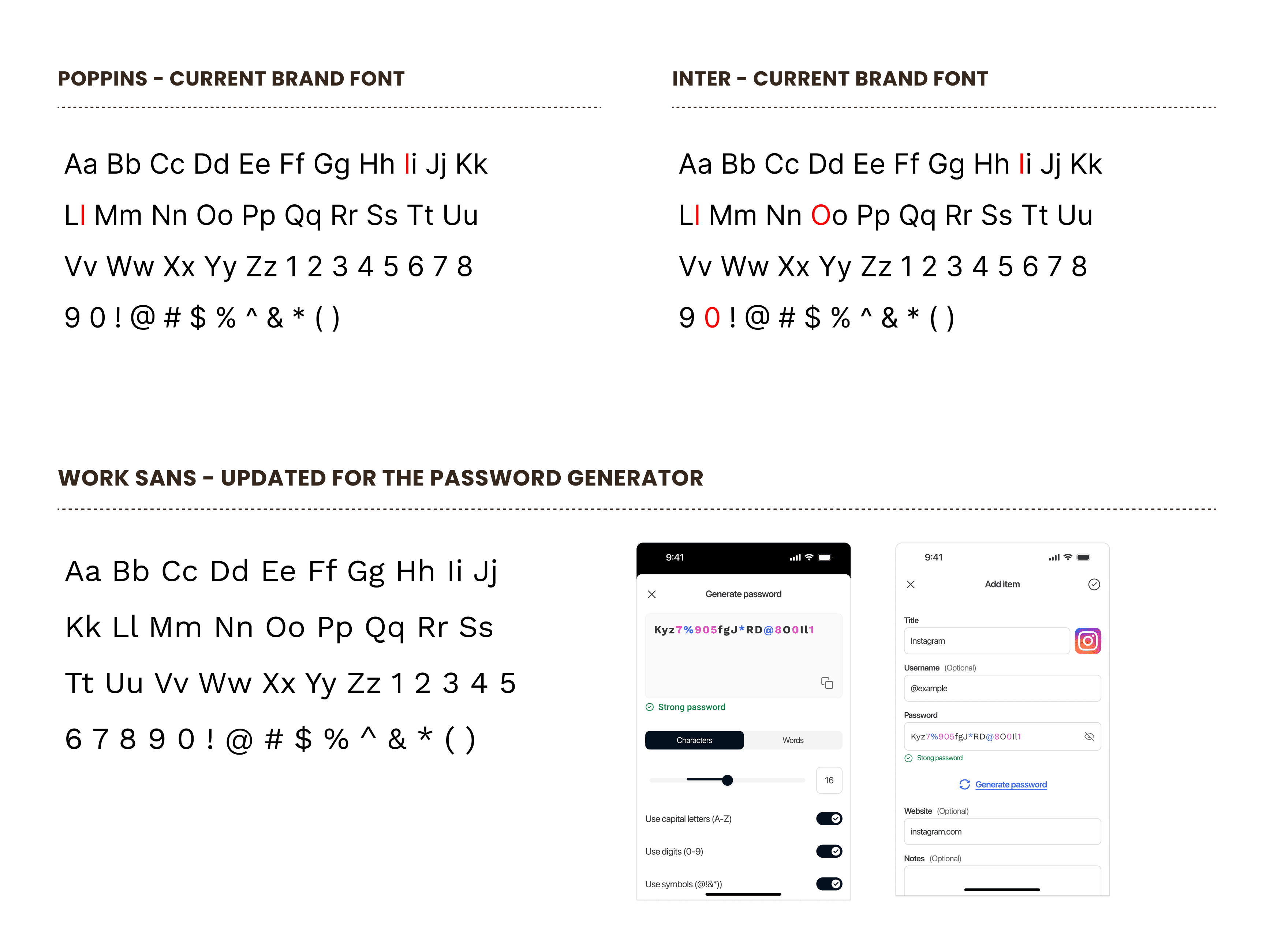
The most significant design decisions, and ones I had to advocate for, came down to password legibility. MEGA's brand fonts, ‘Poppins’ and ‘Inter’: characters such as lowercase L, capital I, and 0 (zero) versus O (Capital) were nearly indistinguishable. In a security-critical context where users need to accurately read and transcribe credentials, this ambiguity was unacceptable, and could lead to permanent loss of account access.
To address this, I proposed switching the font to ‘Work Sans’. As a humanist geometric typeface, it closely matched the existing aesthetic of the current brand fonts, while providing clearer character differentiation.
Alongside the font change, I introduced colour coding to help users easily distinguish letters, numbers, and symbols at a glance. Development pushed back on adding a font variable for a single use case, however, I advocated that the combination of clearer font and colour differentiation was not a cosmetic enhancement, rather a functional requirement. Together, they improved readability and gave users immediate confidence to the user that all password conditions had been met.
In both cases, my advocacy got both design features shipped. The web pattern was then adapted as the foundation for mobile.
Password generator Web and Mobile final designs
Video: Web full password generator flow. Note: features like OTP and Credit cards were added post MVP

Image: Mobile full password generator user flow
Feature #2: Autofill
Autofill was the highest-stakes flow, with 36% of users identifying it as the biggest friction point when using a password manager. To understand expectations, I mapped autofill experiences across iOS, Android, and browser extensions, identifying common patterns, alongside platform-specific constraints.
A key difference emerged around credential saving. Android and browser extensions could automatically save new usernames and passwords, while iOS required more manual management. These platform limitations shaped distinct autofill flows for each environment and informed designs for user scenarios such as saving new credentials versus using existing ones.

Image: Specific UX flow for Android autofill and autosave
Delivering within the launch timeline required a strategic trade-off. Android's autofill flow was significantly more complex than iOS, and with limited development resources, full Android autosave wasn't achievable without deprioritising other critical work. I recommended aligning Android and iOS for launch, and deferring Android autosave to post-MVP.
However, we retained full autosave functionality in the browser extension, where research showed the greatest opportunity for impact: 36% of users cited browser extension friction as their biggest pain point. This decision balanced user value with delivery constraints, creating a consistent mobile experience while preserving capacity for onboarding and free trial improvements.
Autofill Web and Mobile final designs
Video: Extension Autosave + Autofill Flow
Video: iOS Autofill Flow
Video: Android Autofill Flow
Feature #3: Biometrics & PIN authentication
Research and competitor analysis highlighted the importance of allowing users to lock the app without fully logging out, balancing privacy and convenience. The initial solution focused on biometric authentication (Face ID or fingerprint) for mobile.
During feasibility reviews, the development team identified that biometrics for the browser extension wasn't achievable within the MVP scope. Shipping biometrics on mobile without an equivalent auto-lock mechanism within the extension would create an inconsistent security experience, undermining MEGA’s core promise of privacy and security. To address this, I recommended introducing PIN authentication as a cross-platform solution. This provided browser extension users with an alternative to biometrics, while ensuring app-lock functionality was available across all platforms and supported users who preferred not to use biometrics.
Although this increased scope creep, I argued that maintaining trust through consistent security behaviour was more important than preserving the original timeline. Management agreed and the feature shipped across all platforms at launch.
Video: Extension Auto-lock with PIN
Video: iOS Biometric Auto-Lock

Image: iOS Biometric flow
Impact
Launch outcome and next steps
4.5 ★
avg. rating across iOS, Android, Chrome extension
100,000+
downloads on Android alone
20%
conversion from free trial to paid user
"For a new password safe ... very easy, friendly interface and features. I would recommend to others."
USER FEEDBACK
“Secure and easy to use. I like that it has biometric and password unlock… MEGA Pass is a good enough backup and alternative that I would recommend it."
USER FEEDBACK
Post-launch feedback surfaced demand for OTP support, credit card management, and smoother migration, closely aligned with our initial survey findings. This gave the team a prioritised, evidence-backed roadmap for the next phase, with user needs and business opportunities already mapped.
Learnings
Key project learnings
What I'd do differently
Involve developers earlier. Constraints like biometrics on the extension and Android autosave surfaced later than they should have. Earlier feasibility check-ins would have given us more time to design around them.
Document decisions more rigourously. Rationale for certain calls wasn't always captured formally. Better documentation would have made handoffs smoother and decisions easier to revisit.
What I'd do again
Ground every decision in research. Survey data made stakeholder conversations significantly easier and kept prioritisation aligned with real user needs throughout.
Design for platform constraints explicitly. Embracing platform differences rather than forcing a single pattern resulted in a more coherent, trustworthy experience across all four surfaces.
